SaaS Platform, UX Research, UI Design
Complete

.png)


Avertro is a global cybersecurity software company that helps leaders manage the business of cyber. Their SaaS platform focuses on the business benefits of cybersecurity and helps leaders quantify the value for their organisation and prove they are doing cyber right.
Avertro has done well in servicing their existing customers that is largely made up of mid-to-large enterprises. The next challenge for them was to extend their services to also cater for the needs of startup and scale up companies.
Having previously worked in Risk & Compliance, I was able to leverage on my experience and took on the responsibilities below:

We applied the Human-centered Design (HCD) approach in this project and worked through the double diamond.
Read about our journey by scrolling through this page, or click to jump to a section.
Our opening objective was to seek to understand the problem space and explore the problem widely and deeply. After developing a Scoping Framework after the client briefing, we commenced market research in a number of areas:
The research was synthesized into insights and delivered to the client.


We determined a list of start-up and scale-up industries that are most exposed to cyber security risks, and contacted a total of 60 of these companies to understand the specific pain points they face when it comes to managing cyber security and compliance.
We distributed a research survey, and conducted five one-on-one interviews. Questions were formulated to gather both quantitative and qualitative data. The results was ultimately to test the hypothesized problem statement we created based on the client brief.
Start-ups and scale-ups, that need to adhere to cyber security standards, are not able to seamlessly and efficiently understand and manage their cyber risks and communicate their risk mitigation activities to the broader business and investors in a digestible way.
We transitioned from divergent to convergent thinking in the next phase, and used affinity mapping to group similar observations based on their natural relationships.
The research data was methodically synthesized so that we could identify meaningful insights.
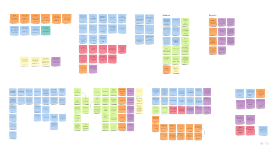
Some of the insights and trends that emerged from our research data are exampled below.
It can be difficult getting funding for cyber security
Cyber initiatives are often assessed based on cost v.s. current risk benefit, and it can be difficult to advocate for funding to implement initiatives where benefits take longer to realise.

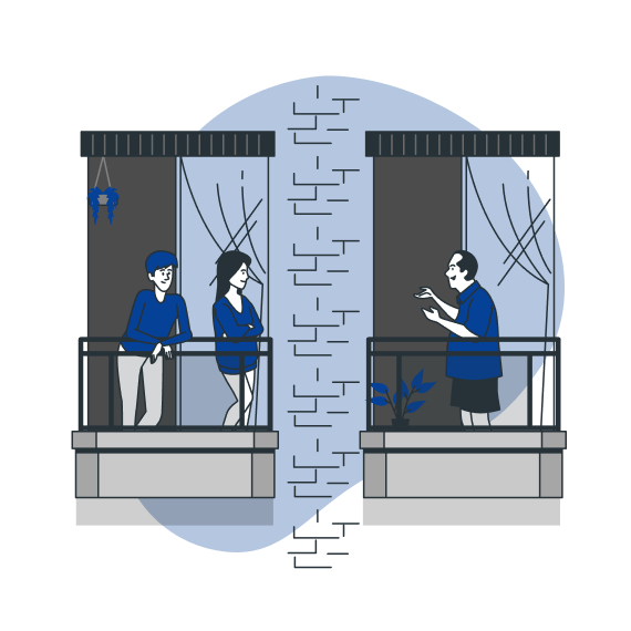
There is a disconnect between Cyber staff and Executives
We found that executives and employees speak differently when talking about cyber, and have different perceptions to what “good” looks like.
There is often no formal cyber reporting pathway
Reporting to upper level management is often ad-hoc and focuses on “what has gone wrong” v.s. “what has gone right”.

To give a human face to the research data to take forward into the design phase, the research trends were summarised into the following user representations.
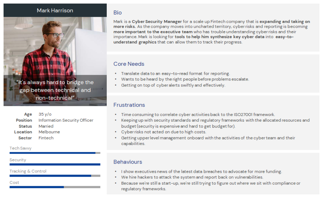
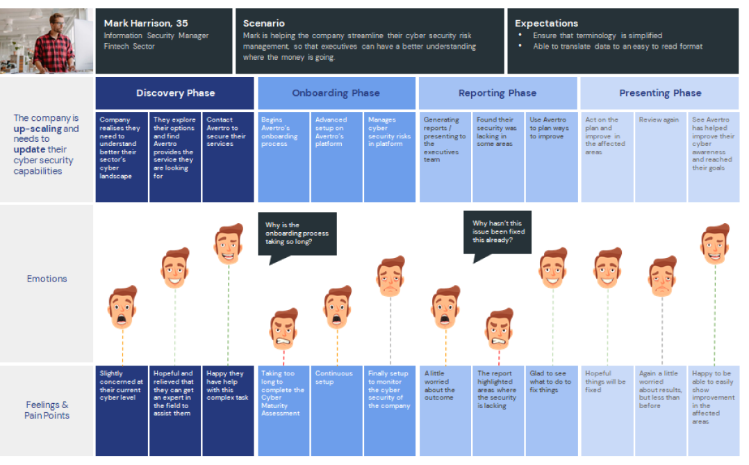
We developed ato represent the primary user group that emerged from our research data - meet Mark!
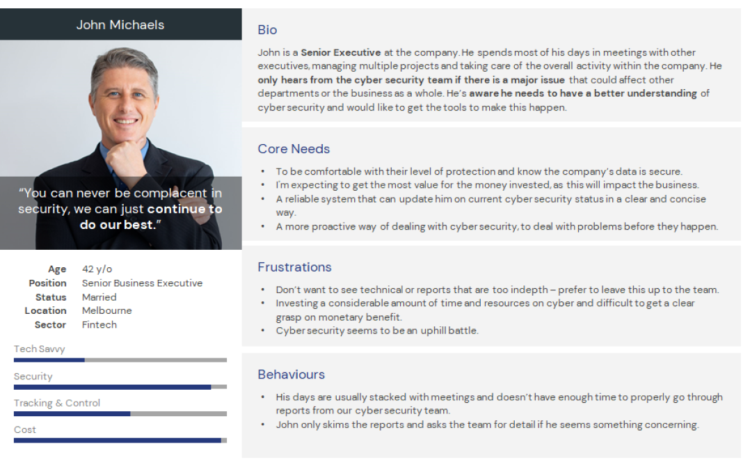
A distinct secondary group of characteristics surfaced in our research, that we felt was important to capture - thus John was born.
Mark's current journey in managing and reporting cyber risks to management was mapped in a journey map, which highlighted opportunities to improve his experience.

Now equipped with a better understanding of the problem, the users, and their journey, it was time to begin ideating on our solution. We facilitated ideation workshops with our stakeholders to generate ideas.
We presented our research findings and artefacts up to this point, and facilitated two Crazy 8 and dot voting sessions that focused on tackling How Might We (HMW) Statement below.

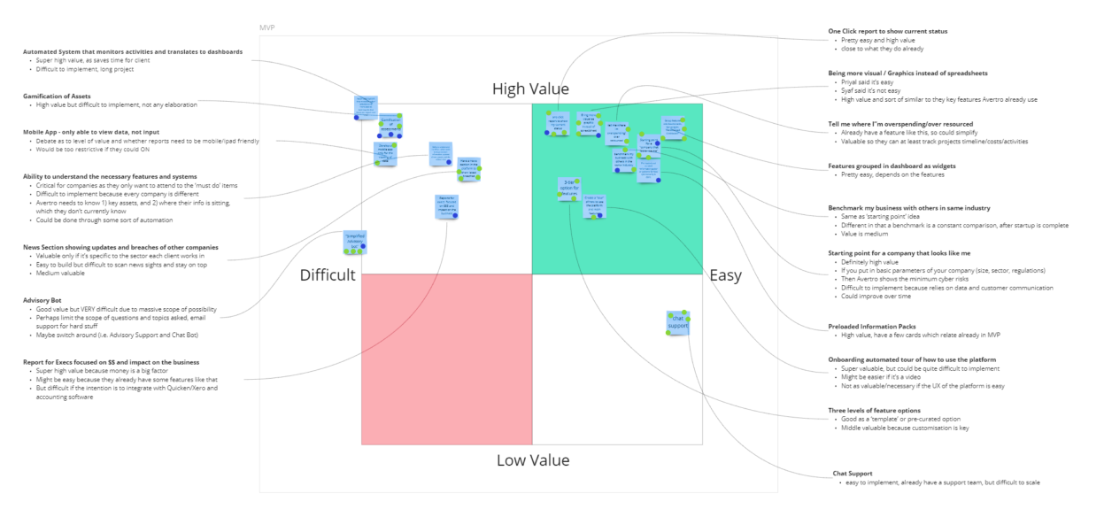
Armed with the winning solutions, we facilitated a MVP mapping session to prioritise features with our stakeholders input. At the end of the session, the most viable features were identified to take forward into solution design.
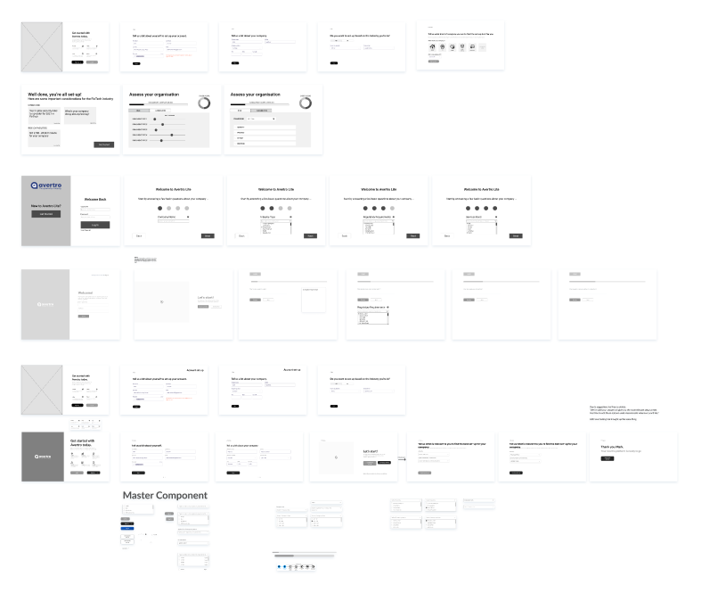
Our team split up into teams to create a number of sketch variations to expand our thinking and mash up ideas to reach consensus at speed.
We considered the visual hierarchy and layout of individual frames, and the underlying series of flows and interactions. Our primary focus was to make the interface as intuitive as possible for the user.
We then selected a set of brand colours and typeface to increase the fidelity of our wireframes for further design and testing.
We wanted to create a colour palette that felt trustworthy, secure but still fun. We setted on a shade of blue as the primary colour to and picked a few supporting colours that are high in saturation. It was important that the typography was bold but easy to read.
With the brand colours and typeface selected, we began applying these to our Figma wirefranes and transitioned our low fidelity mockups to high fidelity mockups and prototypes - the final stretch had begun!
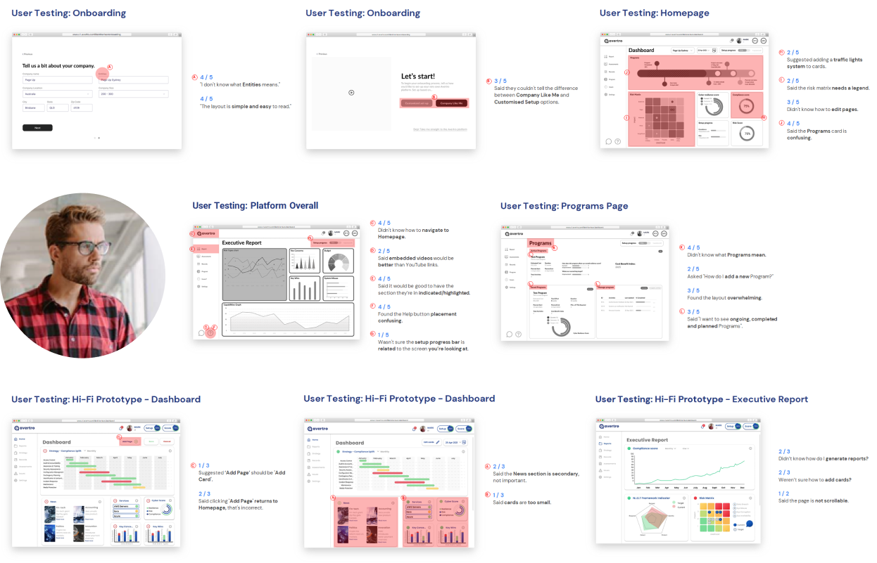
We found five users that fit Mark’s profile and performed Usability Testing through Zoom.
We observed how each user interacted with the prototype and created a script to test different scenarios and tasks.
We affinity mapped the results and iteratively refined our designs based on the feedback we received.
First, users are introduced to the login screen.
Here, new users are prompted to create an account. Existing users can log in directly to access the Avertro platform.
%201.png)
If they are a new user, they are directed to create an account.
The next few pages are forms designed to capture a new user’s details and information about their organisaion in a streamlined manner.
.png)
Users are then given an option to auto-fill their compliance assessment.
Users can link their Avertro account to certain systems to run an automated cyber assessment against their Cyber Standard of choice.
.png)
Finally, users are taken to the Cyber HQ dashboard.
If their system accounts are linked to Avertro, they can immediately see their assessment outcomes on the dashboard, and their current level of cyber maturity.
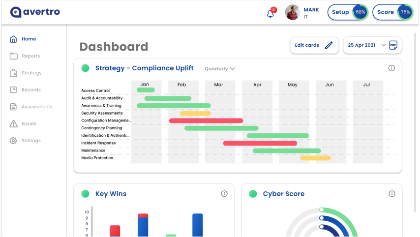
The prototype showcases a streamlined onboarding process, giving the user a chance to interact with a step-by-step process to input their details and set-up the platform.
The dashboard is simplified, and information is displased in customisable cards.
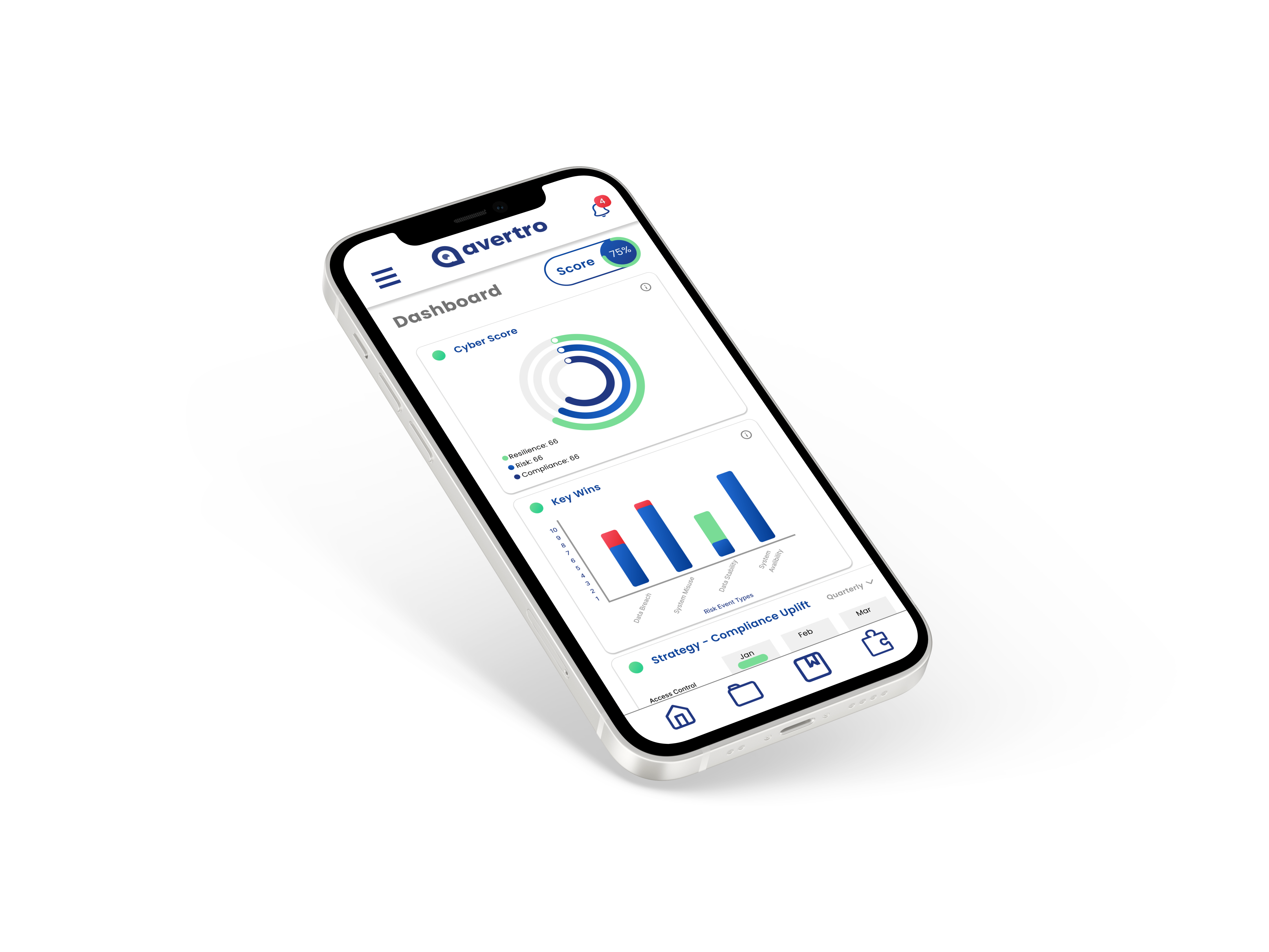
As a proof of concept, we created a concept design to showcase what the Avertro platform could potentially look like as a mobile app.
However, more research and testing would be necessary to validate the value.
We were thrilled to receive some of the feedback below in our presentation session